


Chapter 4. Tutorial: Using Layout Management
- Table of Contents
- Putting A Form Together With Layouts
- Popular Mechanics: Working With Spacers
- Putting A Form Together With Layouts
Let's start this tutorial with a simple truth: Each form in each application needs to have a layout. You might not have given this much thought, but when you created the pizza entry form in the previous tutorial, you were actually laying out the dialogs: You decided where to put the individual widgets, what size they should be, and so on.
Perhaps you thought that this was not much of a problem, but doing the layouts this way by hand leads to a number of problems:
-
The layout process gets increasingly difficult in larger dialogs.
-
If the form is a dialog, it will not resize correctly. Once the user resizes the dialog, your carefully crafted layout is shredded to pieces. Of course, you can make the dialog non-resizable, but it is very likely that your users will not be too happy about this.
-
If you want to internationalize your program, your handcrafted layouts will not work either. Internationalizing a program means preparing it for translation, and you only do this if you expect there to be translations later. But translations, especially from English to other languages, have the nasty property that the translated text is often longer than the original text. Think of a check box whose label has become larger after translating: The check box might not be large enough to accommodate its own label, and even if it could magically resize itself somehow, the check box would no longer fit in the surrounding group box, and so on.
-
If you want to allow the user to run the program with different application fonts, then all the problems just described apply as well.
-
And finally, the same goes if you want to be able to switch widget styles dynamically (or let the user do so); i.e., you do not want to hardcode the widget style.
Hopefully, you are now convinced that handcrafted layouts are not the way to go. But what is the alternative? Qt provides a sophisticated layout system that does all the laying out for you. If you want to program layouts using this system directly, then you have to learn quite a lot and follow a number of rules, but with Qt Designer, using automatic layouts is quite intuitive.
Putting A Form Together With Layouts
In this section, we will create a form that resembles the one we did in the previous tutorials, but we will use automatic layout management. The final form will look strikingly similar to the one you already created but will behave a lot better with respect to the aforementioned problems. Also, you will see that the design actually goes faster with layout management once you get used to it.
Let's take a fresh start and begin with an empty form. Start Qt Designer, if it is not yet running, and click on the icon for creating a new form. Select Dialog as the form type.
Again, we start with the toppings, but this time we will begin with the button group right away and just put the check boxes on top of it. So, select the button group tool and insert a button group. Give it the text Toppings and make it large enough so that you can put four check boxes onto it without problems. You can even make it really huge; we will have it automatically resized later.
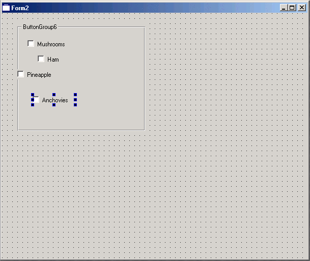
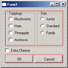
Now, select the check box tool and put a check box onto the button group. Change the label to Mushrooms. Repeat the process with three more check boxes, labeled Ham, Pineapple, and Anchovies, respectively. You do not need to be careful about alignment; just put the four check boxes roughly below each other. When you are done, your form might look like the one in Figure 4-1.
Now we want to lay out this button group with its four check boxes. This requires some thinking. Automatic laying out in Qt is always done with respect to a container; you could say that it is the container that is laid out. In practice, there is nothing special about containers: any widget that happens to have child widgets is a container. Just remember that when you want to arrange a few widgets—like the four check boxes in our case—the layout process applies not to the widgets but to their container (parent)—in our case the button group.
The next thing to think about is which kind of layout you want. Qt currently provides three different kinds of layout managers: one that arranges the widgets horizontally (in a row), one that arranges the widgets vertically (in a column), and one that arranges the widgets both horizontally and vertically (in a grid). You can also combine different layout managers to achieve the desired result; for example, you might often find the grid layout manager's layout policy a bit too restrictive and resort to putting together some rows and columns, which gives you much more flexibility for the price of a bit more work.
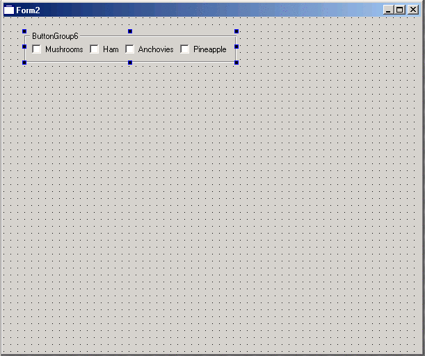
For our button group with the four check boxes, it is obvious that we want a vertical layout; i.e., that we want to arrange the check boxes in a column. And we also know now that we need to apply the layout to the button group, not to the check boxes themselves. So, to put all this together, click on the background of the button group widget and select Lay Out/Lay Out Vertically, click on the vertical layout button on the toolbar (see Figure 4-2), or select Lay Out Vertically from the button group's context menu. Magically, all the buttons are aligned, and the button group has exactly the size it needs to accommodate the buttons (see Figure 4-3).


Assigning a layout has some other consequences: If you now click on one of the check boxes, you will see that the handles are no longer black but gray. If you try, you will also notice that you can no longer move or resize the check boxes. This is because the column layout manager that you have assigned to the button group has taken over the responsibility for assigning sizes and positions to the laid out widgets. If you look very closely at the property editor, you will also notice that the property geometry has disappeared from it—again, because you cannot change it any longer.
If you want to change the sizes or positions of the laid out widgets again, you have to remove the layout manager. This is called breaking the layout. You do this by selecting Lay Out/Break Layout from the menu bar, by selecting Break Layout from the context menu of the button group, or by clicking on the toolbar button for breaking the layout (see Figure 4-4).

You might want to try the other layout managers as well. Break the column layout and assign a row layout instead (see Figure 4-5). You can also try a grid layout, but you will not see much good in this situation; we will explain why later. However, when you do these experiments, it is good to know that you can always go back with the undo button (see Figure 4-6) or by selecting Edit/Undo from the menu bar. With the undo and redo functionality, you can explore various options for your forms without committing to anything that you cannot take back later.

When you are done trying various things with the toppings button group, restore the state of Figure 4-3 and start working on the button group for the pizza size. You should put it somewhere to the right of the toppings button group, but again, you do not have to worry about alignment yet; this will automatically be taken care of later. When you are done, assign a vertical layout to the size button group as well. Your form should now look roughly like the one in Figure 4-7.

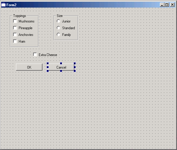
Now finish putting elements onto the form by inserting the Extra Cheese check box and the OK and Cancel push buttons. Put them roughly where they were in the previous form. Your form should now look like the one in Figure 4-8.
At this point, you could say that we have five different elements on the form: the two button groups, the Extra Cheese check box, and the two push buttons. At this stage, we do not care about the fact that the button groups actually are compound elements as well. They are laid out and done. We just consider them elementary widgets for the time being. But now we want to lay out these five elements. This is a typical situation when designing a form with Qt Designer: The idea is to do the design in two different stages. First you put all the widgets onto the form and assign them the desired properties, then you lay them out by assigning layout managers. Of course, in evolutionary development, you will go back to stage one now and then (this often means breaking layouts); add, remove, or change some widgets; and then go back to laying out. The distinction between the two stages is more a conceptual one than one that is enforced by the program.
We might be able to arrange the five elements into a grid, but this would probably look unnatural. Instead, we will try to find a good combination of rows and columns. There are not so many rules for doing this. You basically learn this by doing, experimenting, and looking at other people's well-designed dialogs (or learning from the mistakes being made in the not-so-well-designed dialogs). But one common theme in dialog design is that the main orientation is vertical; i.e., that the dialog consists of a number of rows that are laid out on top of each other. Sometimes, the rows have some internal vertical structure as well, and sometimes these internal vertical structures have a horizontal structure, but this is rather rare.
If you look at your form in its current state, you might already see this pattern: We could assemble the two button groups in a row, leave the Extra Cheese check box on a row by itself, and put the two push buttons in a third row. Then, we just put these three rows on top of each other in a vertical layout.
Let's start following this plan by putting the two button groups in a row. Earlier, you learned that layout managers are always applied to a container, and it is difficult to see a suitable container for the two button groups here. The only parent that they have is the form as a whole, and this will not work, because assigning the form a row layout manager would mean that all five components would be put in one row, which is certainly not what we want.
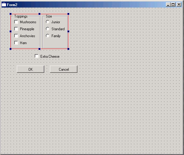
Luckily, we can just select the widgets that we want to be laid out and select a layout manager for them, and Qt Designer will automatically provide an invisible container. In the generated dialog or widget, these invisible containers will be sublayouts. Thus, click on the left button group, hold down the Shift key, and click on the second button group so that these two (and nothing else) are selected. Now use any of the means described earlier to assign a horizontal layout manager. The two button groups are aligned, and a thin red frame indicates the invisible container that was created to hold the row layout manager (see Figure 4-9).
Now do the same with the two push buttons. With these steps, the elements to be laid out have been reduced to three: the two laid out rows and the single check box in between. It is not necessary at this point to put the check box in a row all by itself.
Next, select the form by clicking on the background, and assign a vertical layout. This will arrange the remaining three pieces: the row with the two button groups, the Extra Cheese check box, and the row with the push buttons on top of each other. Now all the widgets are nicely grouped together, as you can see in Figure 4-10. Some things might not be perfect (for example, the Extra Cheese check box should be centered below the button groups), but we'll fix that later.
To test the correct behavior of the dialog while resizing, go into test mode as described previously and try resizing the dialog. See how the space is distributed among the widgets. Also notice that you cannot make the dialog smaller than the minimum size needed to accommodate all the widgets.
| |
|
|
| Connecting Widgets To Each Other | |
Popular Mechanics: Working With Spacers |