Chapter 2. Tutorial: Creating A Simple Application With The Help Of Qt Designer
In this chapter, we will write a small application with the help of Qt Designer. Our goal will be to write one of those famous “pizza order-entry applications,” where you can choose various toppings, order extra cheese, and so on. Clicking on the OK button should send your order to a pizza delivery service, but we will have to leave the actual order transmission to you as an exercise and concentrate on creating and showing the order dialog instead.
Becoming Familiar With Qt Designer
Start your work by bringing up Qt Designer. If you have installed Qt according to the installation instructions, you should be able to invoke it as:
designer
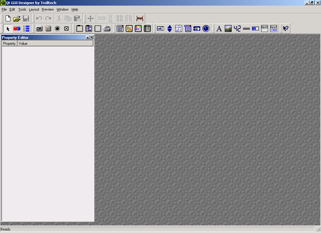
in a Unix shell or a Windows command-line prompt, or click on the Qt Designer icon in Windows. After the splash screen disappears, you should see the screen shown in Figure 2-1. [1]
Now we can start creating the first dialog. Choose File/New from the menu or press Ctrl-N. You will then see the dialog in Figure 2-2. Here you can choose from several types of forms, the most common ones probably being a new dialog and a new widget. If you have developed software with Qt before, you probably know the difference: A dialog is always a window of its own, while widgets usually are integrated into some other widget or a dialog. Among the other options that you have at this point are creating a wizard and creating a dialog with some predefined buttons.
The term form might need some explanation. Everything that you design in Qt Designer is a form. This could be a widget, a dialog, or a wizard, and maybe in the future even other things. We'll use the term form here when it does not matter whether we are working with a dialog or a widget or something else and just want to refer to whatever you are currently designing in the right half of the Qt Designer window.
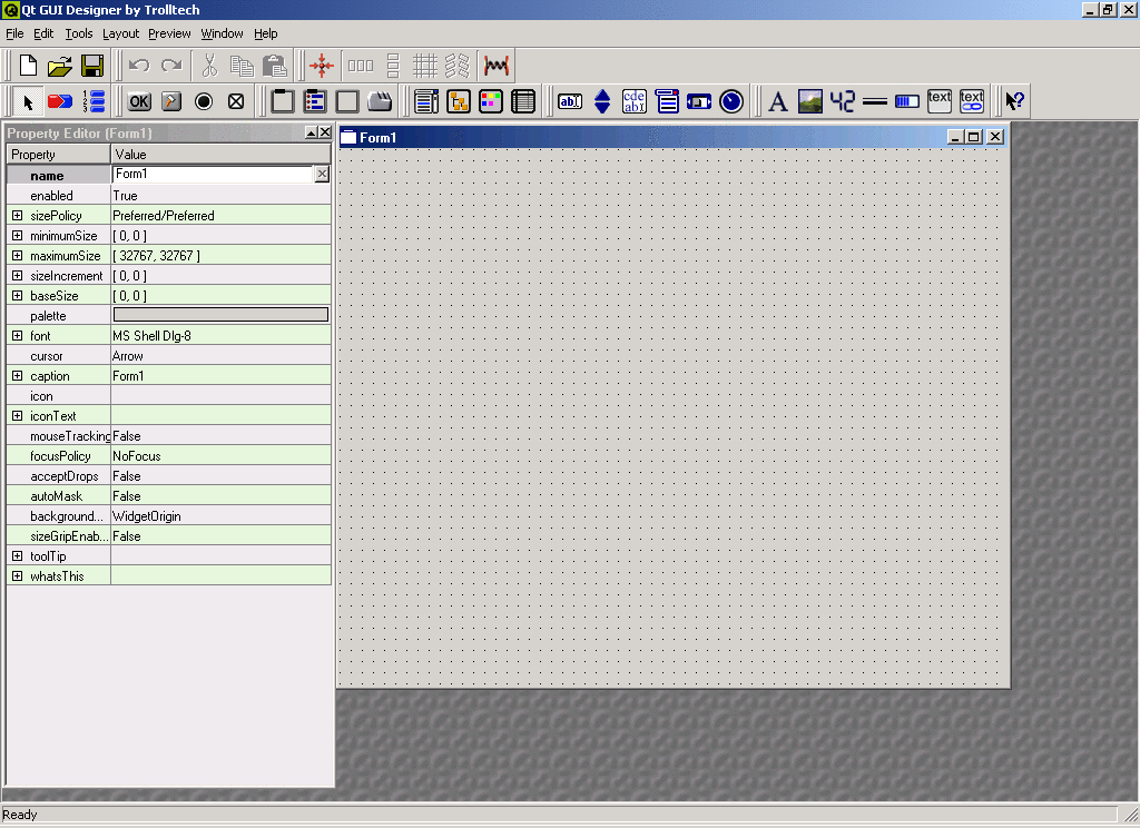
Since we want a dialog in which we can specify our pizza preferences, click on Empty Dialog here. Now the Qt Designer screen changes fundamentally and becomes a lot less boring, as you can see in Figure 2-3.
A First Look At The Property Editor
Let's take a moment to go through the things that are now visible on the screen. To the left, you can see the so-called property editor, which, obviously, lets you edit various properties of your dialog and, as we will see later, the UI components that you put in your dialogs. A property, in Qt lingo, is one attribute or characteristic of a UI component. This could be the size, a color, the title bar of a dialog (the so-called “caption”), switches that change the behavior of the component, and many other things. Depending on the type of the property, you will have various possibilities for editing it. Let's look at just the first three properties that Qt Designer displays for our freshly started dialog.
The property name specifies the internal name of the dialog. It is nothing that your users will ever see but is a moniker that will help you, the developer, to find all your components easily. Since names are strings, Qt Designer provides a text-entry field next to the property name. There is already a default name, Form1, filled in here, but this is both not very descriptive and just plain boring, so click in the text-entry field and change the name to something more suitable, like PizzaEntryForm. You will notice that the property name is now displayed in bold type; this indicates that this property has been changed from its default value. If during your editing you'd rather have the old value of a property back so that you can start over, a click on the little cross icon next to the edit field sometimes restores the initial value. Whether this works or not depends on whether the property really has an initial value. In any case, you can revert from your changes by selecting Edit/Undo from the menu or by clicking the corresponding toolbar button.
The next property in the property editor is called enabled and has a boolean value; i.e., it can be either true or false. Obviously, we want our dialog to be enabled (otherwise, we could not enter our pizza order), but let's try changing the value of this property anyway. Instead of a text-entry field, the property editor provides you with a combo box where you can choose between the values true and false. You will find these combo boxes wherever there is a fixed number of values to choose from. Most often, this will be a boolean choice of true or false, but there will also be combo boxes for Qt's enumeration types.
Before you go on to the next property, make sure that the value of the property enabled is reset to true.
The next property, sizePolicy, could be called a compound property, because it has several subproperties that each have a value of their own. The compound property itself does not have a real value, but Qt Designer displays all the individual values of the subproperties here.
You can see that sizePolicy is a compound property, because it has a little plus sign next to its name. If you click on the plus sign, a new level will open with the subproperties (in this case: hSizeType and vSizeType). It does not matter here what these properties mean; without some more intimate knowledge of the layout system in Qt, you would not understand it anyway. All you should need to know at this point is that the plus sign indicates a compound property that has subproperties hidden behind the surface that each have names and values of their own.
If you are beginner in Qt programming, you will see many properties whose purposes you do not know yet, and even if you are a seasoned programmer, you might not know the meanings of all of them by heart. That is no problem. All the properties have reasonable default values, so you can just ignore any properties that you do not understand yet and come back later to change them, if this is needed at all. Also, you can always click on a property and hit the F1 key to get some information about this property.
A First Look At The Form Editor
While the property editor occupies the left half of the Qt Designer window, the form editor occupies the right half. Here, you “draw” your dialogs by placing UI components on the empty space provided and arranging them.
| Manual Placement and Layouts |
| In this tutorial, we will use manual placement; i.e., you will explicitly assign positions and sizes to the UI components that you place in your dialog. This is good for now but has a lot of disadvantages in the long run. You will learn in a later chapter how to use Qt's layout system from within Qt Designer to get an automatic layout. |
Let's start bringing a few components into the dialog. We want to let the user choose from the toppings mushrooms, ham, pineapple, and anchovies. [2] It should be possible to select whether extra cheese is desired and whether the size should be junior, standard, or family. Once the user has made the choices, he or she can either click the OK button to send the order (in a real application) or back out by clicking Cancel.
First, we do the topping selection. In our application (and probably in any decent pizza service), you can choose any combination of toppings, including all the available ones or none. This kind of selection, letting the user choose any number from a fixed number of options, is done with so-called check boxes. These have different looks depending on the GUI style that you use but are often some kind of square. Also, because we want to show the user that all the topping selections are together and that this is really about toppings (and not the color of the cardboard box the pizzas will be delivered in), we want to draw a rectangular frame with a title around the check boxes. These frames are called group boxes, because they group other UI elements visually.
But now it is time to bring the first check box onto the form. To do this, you need to choose the check box tool. With Qt Designer, forms are designed by employing a number of tools, each of which lets you either insert a special kind of UI element or perform some other action, like selecting. To select the check box tool, either click on the check box icon (see Figure 2-4 ) or select Tools/Buttons/CheckBox from the menu. The changed text in the status bar indicates that you have selected a new tool; in addition, the mouse cursor becomes a cross instead of an arrow when you move it over a form.
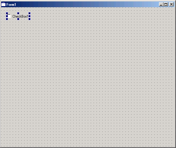
To bring your first check box onto the form, simply “draw” it: Press the left mouse button where you want the upper-left corner to be, hold it down, and move the mouse to the point where you want the lower-right corner to be. Then release the mouse button. Immediately, you will see your check box in the form. You should put it somewhere near the upper-left corner of the form but not too close so that we still have space for the group box we want to draw later (see figure Figure 2-5). To do this, you first need to switch from the check box tool to the ordinary selection tool by clicking on the pointer icon; otherwise, each click on the form would insert another check box.
If you do not like the position you chose, you can always move the check box by simply “grabbing” it with the mouse and dragging it to where you want it to be.
If you'd rather not decide on a suitable size for the check box now but want to let Qt Designer give it a reasonable default size, then just click on the form: The check box will be inserted with its default value, [3] with the upper-left corner at the position of the mouse click. This size can always be adjusted later, either by dragging the handles or more automatically; you will soon learn how to do the latter.
You may have noticed that the property editor changed when you inserted the check box. The check box is now the currently selected element, and the property editor always displays the properties of the currently selected element. To try this, just click with the mouse elsewhere on the form. The property editor will then display the properties of the whole form again.
Click again on the check box. Qt Designer has by default given it the text label CheckBox1, but of course, that's not what we want; we want Mushrooms. So, click on the text field in the value column next to the text property, delete the old text, and enter Mushrooms. Watch how the label of the check box in the form changes immediately while you type. Talk about instant feedback!
The check box might not be wide enough to accommodate the full label text. In this case, just make the check box wider by clicking on it and dragging the handle in the middle of the right margin farther to the right until the label fits. Or even easier, click with the right mouse button to open the context menu, and select Adjust Size, which will give the check box the exact size it needs to display the little square and the label.
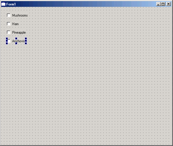
Once you are satisfied with your first check box, add three more for Ham, Pineapple, and Anchovies in the same fashion. Place the four check boxes below each other, as in Figure 2-6.
When changing the text labels of the check boxes, you do not necessarily need to use the property editor. Changing the label of a check box is such a common operation that there is a shortcut for it: Right-click on an already inserted check box while the selection tool is active, and a context menu will pop up. Here, you can select Edit Text..., which will open a small dialog box where you can enter the new label. This has the same effect as changing the text property in the property editor. Qt Designer also has the nice feature of letting you change the most important property by simply double-clicking on the widget on the form whose property you want to change. Which property is considered the most important depends on the widget; it is always the one that is shown at the top of the context menu you get when you right-click on the widget.
Now we are done with the check boxes and want to put a group box around them so that they are visually grouped together. To do this, choose the button group tool (see Figure 2-7). Button groups are like group boxes but provide some extra functionality to the included buttons that we do not need to go into now.
“Draw” the button group so that it surrounds your check boxes. Oops! When you release the mouse button, the group box is smart enough to know that you do not want to put it over the check boxes (if you wanted that, why would you have inserted the check boxes in the first place) but that you want the group box to be a parent of the check boxes, meaning that it is responsible for where the check boxes are and that the check boxes lie on top of the group box. If you already know programming with Qt (or with most other toolkits, for that matter), you know what all this is for. If you are interested in more details about parent-child relationships and how Qt Designer handles them, please see the sidebar “Parent-Child Relationships In Qt Designer.”
Parent-Child Relationships In Qt Designer: Even less experienced Qt developers know that all widgets are arranged in one or more parent-child hierarchies. At the root of this hierarchy sits a so-called top-level widget, a window that is decorated by the underlying window system with a frame, a title bar, and often some control buttons and a window menu. All widgets inside are descendants of this top-level widget—some are direct; others, as in the case of group boxes or button groups, are deeper inside the hierarchy. Most applications have only one permanent top-level widget, which is often called the main window and contains the menu bar, any toolbars, perhaps a status bar, and the main document window. In addition, dialogs are top-level widgets: They do not have a parent and get a window-system frame but are usually transient; they go away after the user is done with them.
When you write a Qt application “by hand,” you have to take care of the parent-child relationship yourself by specifying a parent widget when you create any non-top-level widget. When you use Qt Designer, this is handled for you automatically. When you put one widget on top of another, the topmost one automatically becomes a child of the lower one. If you later move the upper widget off of the lower one, the lower one is automatically reparented; i.e., it gets the form as its new parent (or another widget, if it is moved on top of another one).
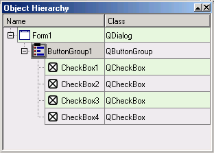
You can check the widget hierarchy yourself by selecting Window/Object Hierarchy from the menu bar. This opens a window that displays the parent-child relationships of the current form in an intuitive, hierarchical manner (see Figure 2-8). For example, first open this window with all the check boxes on top of the button group, then move one of the check boxes out of the button group and look at this window again.
Before we continue with the next widgets, we need to give the button group a good header text. So, select Edit Title... from the context menu to give the button group the title Toppings, or achieve the same result by changing the title property in the property editor.
Notes
| [1] | This screenshot and all the following ones were taken on a Windows system. If you are running a Unix system, your screens may look slightly different. |
| [2] | These options do not necessarily reflect the tastes of either the Trolltech engineers or the manual writer. |
| [3] | Actually, the value chosen here is the size hint of the widget that is returned from the method sizeHint(). |


